

Project
C-Section Care recognizes the gap in postpartum care for C-section mothers—an essential recovery phase often overlooked in the regular healthcare system. Too many women are left navigating this journey alone, without the proper support or recognition of their experience. They are here to change that. Their mission is to provide expert care, guidance, and a community that embraces the beauty and strength of every C-section birth. By shifting the narrative, they empower mothers to heal with confidence, knowing their experience is not just valid but worth celebrating.
Branding Strategy + Branding Design + Print Design


Process
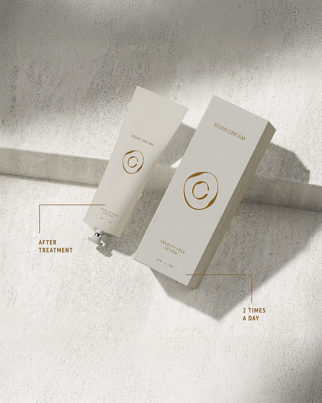
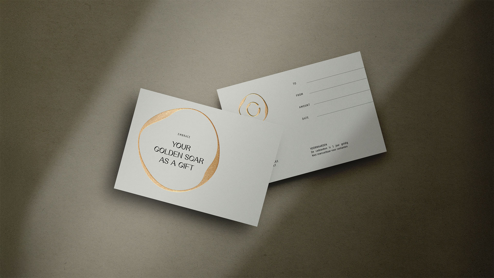
The branding and design of C-Section Care are inspired by the beauty and significance of the C-section scar, transforming it from a perceived imperfection into a symbol of strength and love. The logo reflects this journey, with its varying line thickness representing the natural form of the scar—unique to each mother—while the enclosed shape symbolizes the womb, the safe and nurturing space where life begins. This design is more than aesthetics; it’s a tribute to motherhood, resilience, and new beginnings, reminding every mother that her scar tells a powerful story of love, sacrifice, and strength.

credits
Client / C-Section Care
Design & Implementation / Kensho Design by Kim Schouten
Design & Implementation / Kensho Design by Kim Schouten